Design Process of
2024 PEL SPRING FINALS
The PEL (Peacekeeper Elite League) is a professional mobile gaming league held in China. The Spring Season took place from May 17 to 19, 2024. My team and I created motion graphics for the arena’s LED screens and live broadcasts within two weeks. Specifically, I designed and animated in-game LED graphics displayed during matches.
PEL Spring Season 2024 – Motion Graphics for Mobile Game Pro League
Project Sneak Peek
This LED graphic appears when a player scores the first kill against an opposing player during a match. The initial screen shows the profiles of both the player who secured the kill and the one who was killed. After a transition, the second screen focuses on the profile of the player who achieved the First Kill.
In-Game Trigger 1: First Kill
I developed compositions using gradient effects from the existing brand guidelines' color palette and incorporated the PEL logo as a design element.
1st Pass
1. Requested the use of each player’s team’s primary color as the key color, rather than the brand guideline colors.
2.Suggested adding each team’s slogan to the screens.
3.Wanted to explore alternative design styles.
Client Feedback
Through internal discussions, we took advantage of the vertically elongated screens with diagonal edges to create flag-shaped graphics at both ends. I decorated flags utilizing graphic elements from the brand guidelines and included team slogans along with the PEL logo. I developed two distinct LED design options.
2nd Pass
1. Requested revisions to the decorative graphic elements used on the flags.
2.Asked to add textures to the flags and animate them to resemble real flags.
3.Commented on the main screen’s layout for the player profile, saying it looked like a magazine cover
Client Feedback
<Flat Layout>
<Logo Variation>
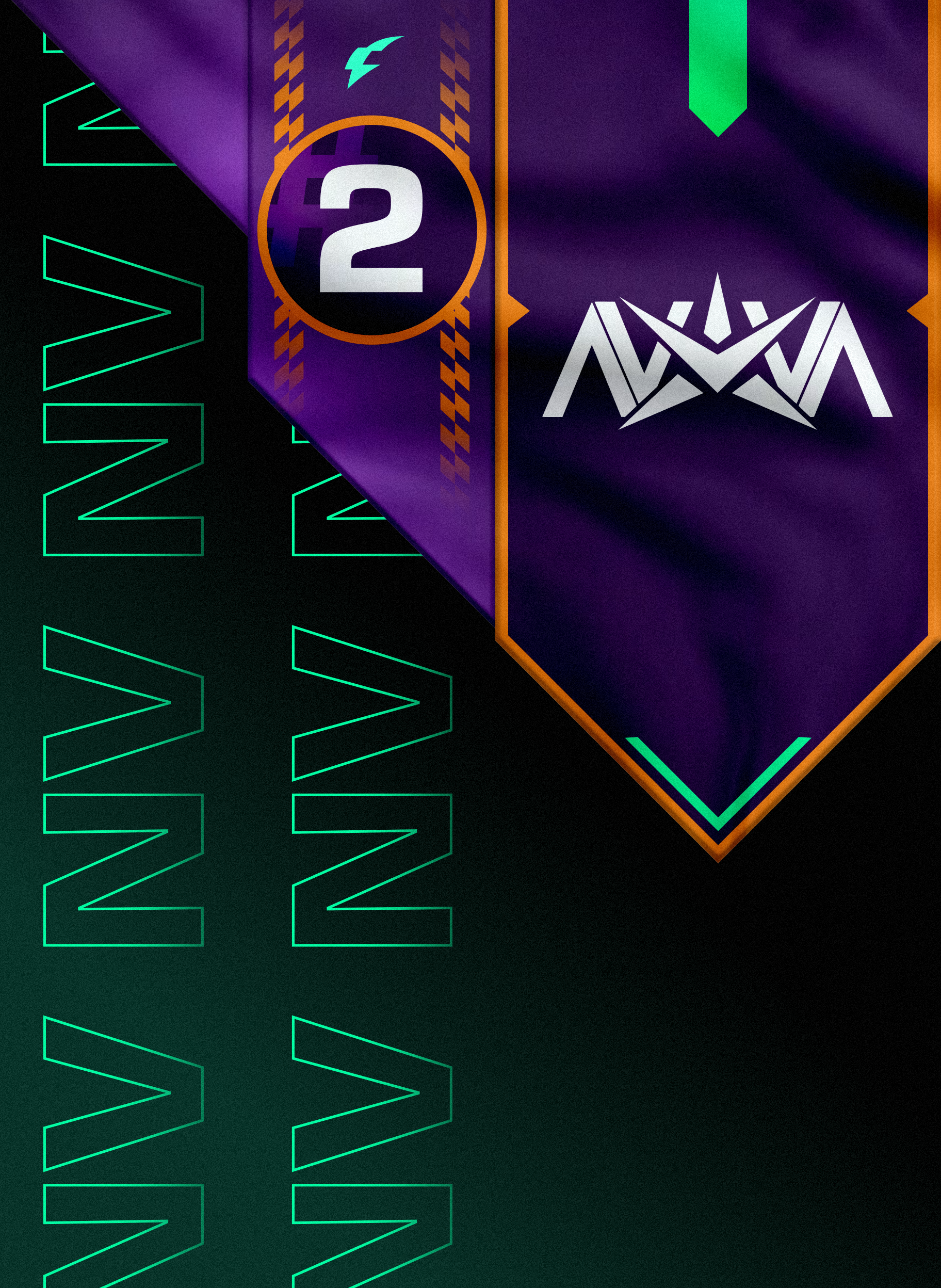
I shortened the flags’ length to better showcase the fluttering animation. Textures were added for a more realistic look, and created new decorative elements using the PEL logo.
Final Adjustments
The Comeback Victory animation plays when a team overtakes their opponent’s kill count. The left screen shows the team in second place, while the right screen displays the team in first place. After a transition, the team that was in second place takes the first-place spot and fills the entire screen with their victory mark.
In-Game Trigger 2: Comeback Victory
I developed compositions using gradient effects from the existing brand guidelines' color palette and incorporated the PEL logo as a design element.
1st Pass
1. The style frame was too similar to designs used in previous matches, and the client appeared to be looking for something more unique.
Client Feedback
<Flat Layout>
We kept the flag concept but changed the style to feel more classic and refined. Added detailed graphic elements to highlight the importance and excitement of a comeback victory.
2nd Pass
1. The bright orange used for the purple team stood out too much and felt overly distracting.
2.Requested the removal of the circular graphic around the ranking numbers and suggested lowering the opacity of the numbers themselves for a more subtle effect.
Client Feedback
<Flat Layout>
Similar to the First Kill, all teams’ point colors were standardized to the vibrant green specified in the brand guidelines, ensuring consistency across designs.
Final Adjustment
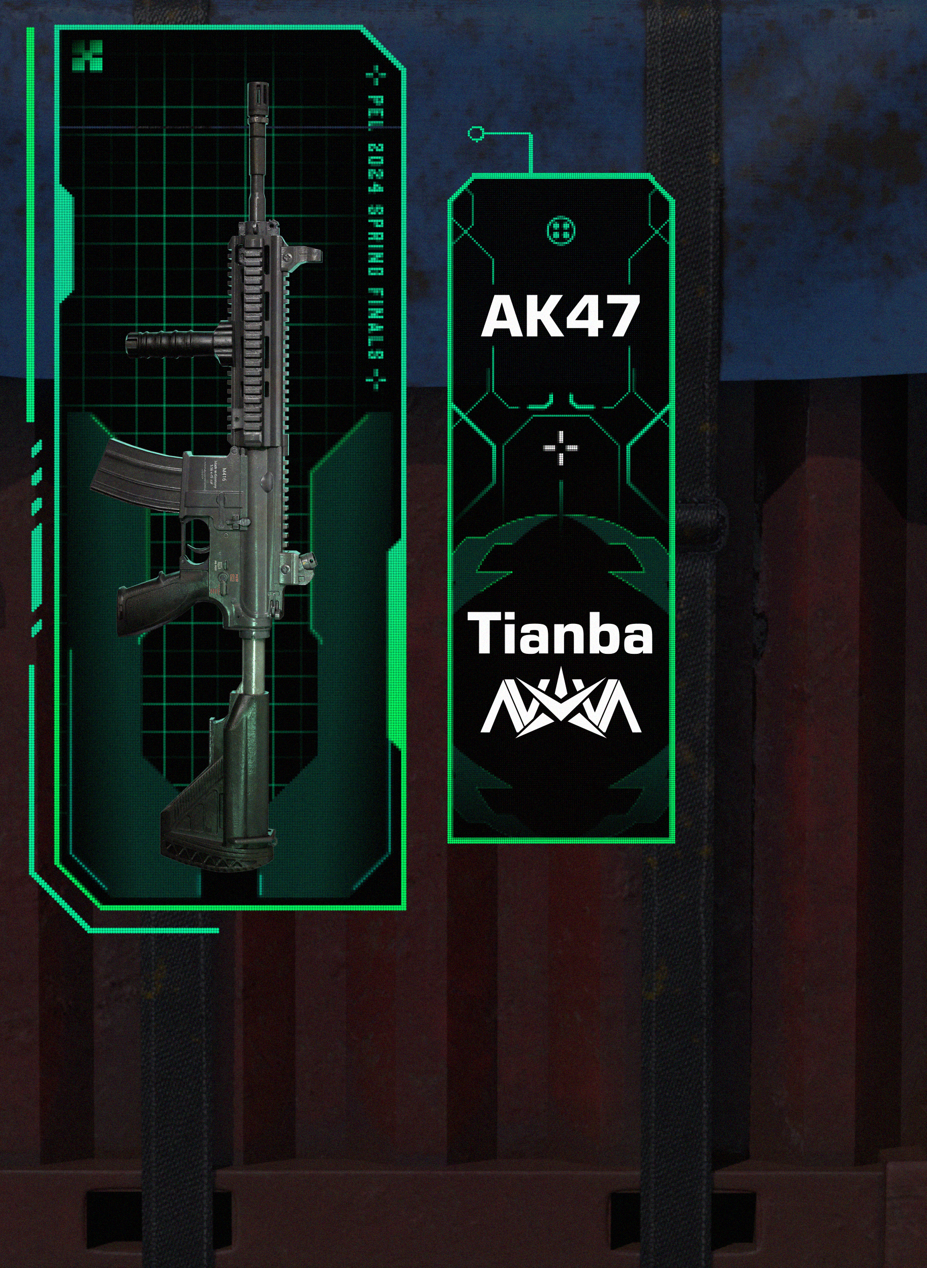
This animation plays when a player picks up a supply drop that has fallen from the sky. It displays information about the items the player has collected.
In-Game Trigger 3: Supply Drop
<Flat Layout>
I developed compositions using gradient effects from the existing brand guidelines' color palette and incorporated the PEL logo as a design element.
1st Pass
In-Game Trigger 3: Heart Rate Monitor
This animation displays players' real-time heart rates, capturing the tension and excitement during moments when a player get a kill, allowing the audience to feel the intensity of the match.
I visualized the players’ heart rates using a line graph. Player photos of varying sizes were arranged on the main screen, with color adjustments and opacity tweaks to enhance the design’s overall polish.
1st Pass
1. The LED team needed to dynamically control and display player photos during the match, which meant no special effects could be applied to the images apart from resizing and opacity adjustments (as their equipment couldn’t replicate those effects).
2.The heart rate graph was requested to be removed.
Client Feedback
<Flat Layout>
Similar to the supply drop design concept, the direction was revised to incorporate a military/sci-fi-style information panel, creating a cohesive look with the graphics shown on the central screen (players’ gameplay screen). A pounding animation was added to the heart icon to grab attention.


